This company invented the network router, and makes more of them than anyone, but you’ve likely never heard of them.
They decided they needed some rebranding, and so approached Futurebrand in NYC with a very limited budget. Being technology guys, not marketing guys, they were a bit skeptical toward the whole enterprise.
They agreed on a limited rebranding, which focused on look and clarity of message. They wanted to be seen on the shelves, and to differentiate themselves from the competition. And they did not want to change their name, even while acknowledging that some people mistake them for a maker of toilet paper accessories.
Futurebrand hired me to write a very condensed and concise styleguide, to help the company and its ad agencies navigated the new brand identity. It was about 45 pages; less than half of a typical branding behemoth. I completed the project in two days.

Text:
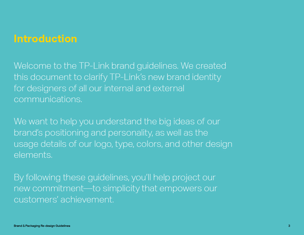
Introduction
Welcome to the TP-Link brand guidelines. We created this document to clarify TP-Link’s new brand identity for designers of all our internal and external communications.
We want to help you understand the big ideas of our brand’s positioning and personality, as well as the usage details of our logo, type, colors, and other design elements.
By following these guidelines, you’ll help project our new commitment—to simplicity that empowers our customers’ achievement.
